Cornerstone

Cornerstone
Design System

Role
Planning, creation, maintenance, and evangelism
Scope
14 components, 4 patterns, plus color, typography, spacing, and tokens
Standard
WCAG 2.2 AA

Cornerstone is a single source of truth for designers, developers, and anyone shaping our product. This case study covers how I planned it, built it, keep it current, and advocate for it.

Primary Secondary Tertiary Danger
BreakfastLunchDinner

One active destination at a time.

name@company.com
We’ll only use this to reply.
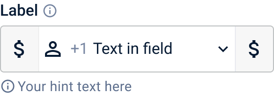
+1 555 01$
Enter all ten digits.
Pizza Cheeseburger Hot Dog2
Notifications on
Dark mode off
Is a hotdog a sandwich?

Technically, a hot dog is often considered a sandwich because it features meat placed inside bread. Which do you think?

YesNo
CancelSubmit
Bacon
Lettuce
Tomato

Deciding what good looks like

Before components came principles. I wrote four to guide decisions when trade-offs are required. They aren’t strict rules; they give teams a shared foundation for conversations and help everyone align on what “good” means.

I also set the accessibility baseline early. Every experience in the system should meet WCAG 2.2 AA, treated as a requirement from first sketch to final build, not something added at the end.

Clarity over cleverness
Make interfaces easy to understand at a glance. Avoid unnecessary complexity.
Design for real people
Create experiences that are inclusive, accessible, and usable by as many people as possible.
Consistency builds trust
Reuse familiar patterns and components to reduce cognitive load.
Build to evolve
Design systems should support change, not prevent it.

Getting the basics right

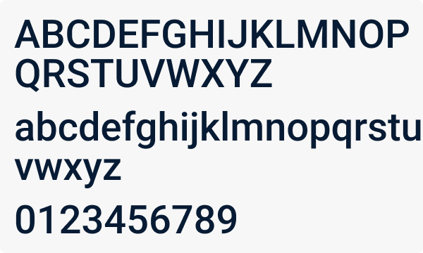
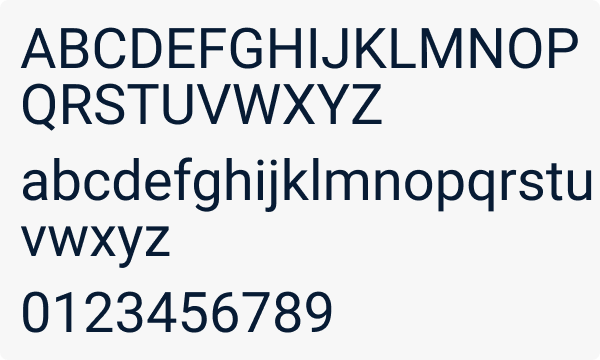
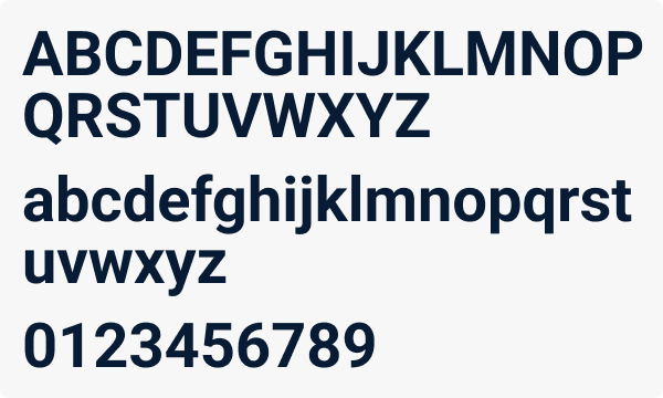
Typography uses Roboto in three weights, with a defined set of heading and paragraph styles. Color starts from a core palette in tonal steps and is applied through usage tokens for text, icons, and semantic meaning.

Text colors are tested against WCAG 2.2 AA, so using the right token means meeting the 4.5:1 contrast requirement without checking it by hand.

Email address
Text / Primary
name@company.com
We’ll only use this to reply.
Text / Secondary
Phone number
+1 555 01
Enter all ten digits.
Text / Danger
Check the highlighted field.
Text / Primary
Icon / Danger
The five boxing wizardsH1, H2Bold 22 / 26
The five boxing wizardsH3Medium 18 / 22
The five boxing wizards jump quickly.LRegular 16 / 140%
The five boxing wizards jump quickly.MRegular 14 / 140%
The five boxing wizards jump quickly.SRegular 12 / 140%
The five boxing wizards jump quickly.XSRegular 10 / 140%
Roboto, Aa
Roboto
Roboto Bold specimen
Bold, 700
Roboto Medium specimen
Medium, 500
Roboto Regular specimen
Regular, 400

Tokens are named for what they do

Text / Primary
Headings, body text, labels
Text / Secondary
Descriptions, helper text, metadata
Text / Disabled
Disabled controls and labels
Text / Inverse
Dark navigation, colored buttons
Text / Link
Hyperlinks, inline actions, navigation links
Icon / Interactive
Clickable icons, icon buttons, toolbar actions

Components with intent

Fourteen components are documented: badge, button, card, checkbox, chip, date picker, dropdown select, grid table, modal dialog, radio button, switch, tabs, text input, and toast. Each page follows one structure, covering anatomy, states, usage, key behaviors, content guidelines, layout, accessibility, and code.

The library follows atomic design, a method by Brad Frost. Atoms like tokens, buttons, chips, and checkboxes combine into molecules like labeled inputs and selects, then into organisms like cards, tabs, modals, and the grid table. Patterns show how those parts come together in context.

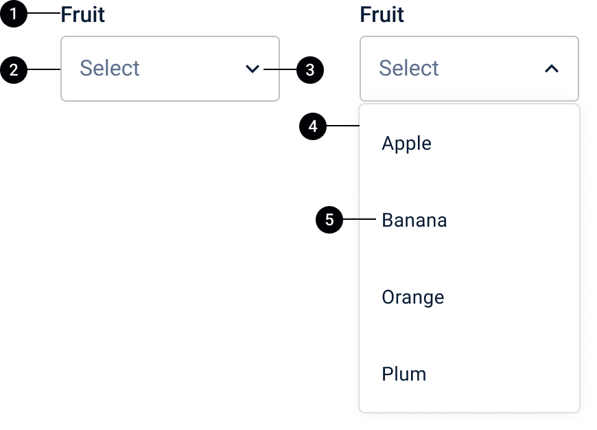
Dropdown select anatomy
Dropdown select
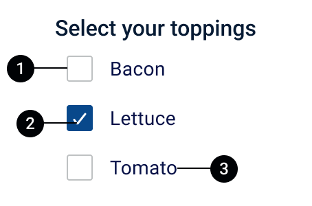
Checkbox anatomy
Checkbox
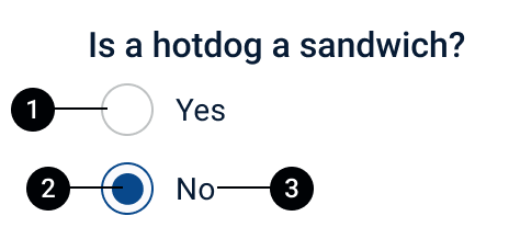
Radio button anatomy
Radio button
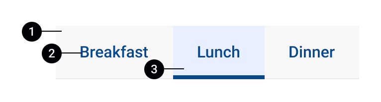
Tabs anatomy
Tabs
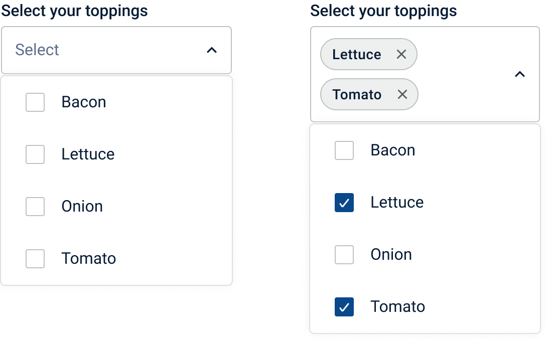
Multiselect dropdown
Multiselect
Chip anatomy
Chips and badges
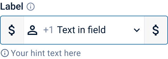
Text input, default
Default
Text input, focused
Focused
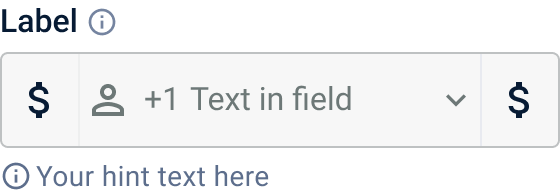
Text input, disabled
Disabled
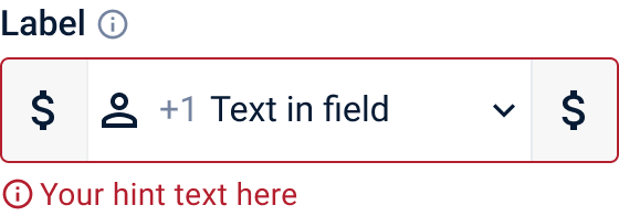
Text input, error
Error
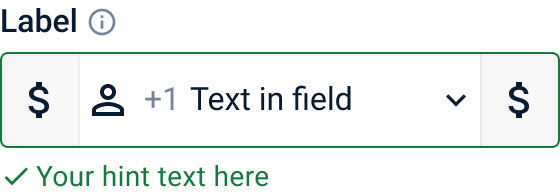
Text input, success
Success

Accessibility, built in

Every experience in Cornerstone should meet WCAG 2.2 AA, so more people can use our products regardless of ability, device, or context. I treat that as a baseline requirement, so the components carry it instead of leaving it to each team.

Every component page splits accessibility in two: what the component is built to meet, and which criteria can still fail depending on how it’s used. Here’s the short version.

9

WCAG 2.2 criteria built into the components

Easy to see

Text meets 4.5:1 contrast, controls meet 3:1, and selection, status, and validation add a second signal beyond color.

1.4.31.4.111.4.1

Clear to assistive technology

Controls carry a programmatic label, state, and group context, and status updates are announced without moving focus.

1.1.11.3.14.1.3

Easy to operate

Keyboard access, a visible focus indicator, and pointer actions that can be cancelled before they happen.

2.1.12.4.72.5.2

What it looks like in the components

Checkbox with a visible checkmark
1.3.11.4.11.4.11

Selection never relies on color

A visible checkmark shows what’s selected, and each checkbox supports a programmatically associated label and checked state.

Radio buttons with a visible inner dot
1.3.11.4.11.4.11

An inner dot, not just a color

The chosen option shows a visible inner dot, and radios keep their label and group context so the set is read as one question.

Tabs with an underlined active tab
1.4.12.1.12.4.7

Active, focused, and operable

The active tab gets an indicator as well as a color change, tabs support keyboard navigation, and enabled tabs show a visible focus indicator.

Text input in an error state with an icon and messageText input in a success state with an icon and message
1.4.11.4.3

Validation says it in words

Error and success pair color with an icon and a text message placed next to the field, so the state doesn’t depend on seeing red or green.

Text input in its focused state
1.4.112.1.1

A focus state you can see

Focused fields add a distinct outline that meets 3:1 interface-control contrast, and fields are keyboard destinations that must never trap focus.

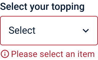
Dropdown select with an error icon and the message Please select an item
1.4.11.4.31.4.11

Errors that say what to do

The message explains how to fix the problem, in this case that a selection is required, and it sits directly below the select with an icon.

How it’s baked in

Tokens carry the contrast
Text color tokens are tested against WCAG 2.2 AA, and component text uses token combinations that meet 4.5:1. Boundaries and focus indicators meet 3:1.
State is never color alone
Selection, status, and validation each add a second signal: a checkmark, an inner dot, thumb position, a tab indicator, or an icon with a message.
Keyboard rules are specified per component
Buttons activate with Enter or Space, tabs use arrow keys, Home, and End, and the date picker and dropdown close with Escape. Modals keep focus inside and return it to the opener, and toasts never steal focus.
Names and labels are required
Every input needs a programmatically associated label, and placeholders don’t count. Icon-only buttons need an accessible label, and removable chips need a named remove button.

Where use can still break it

1.4.3 · Button
Placing a button over a dark background
2.4.6 · Button
Vague labels such as “go,” “more,” or “do it”
3.3.1 · Text input
Showing an error only with an icon and color
3.3.3 · Text input
An error hint that only reads “Error”
2.1.1 · Card
A card that opens on click but not with Enter or Space
2.2.1 · Toast
A toast with a required action that disappears before it can be read
4.1.3 · Toast
A saved confirmation that appears visually but isn’t announced
1.4.10 · Grid table
Two-dimensional scrolling to read simple data on mobile

Keeping it accurate

Documentation only helps if it stays true to the product. Each component page links to Storybook, which I treat as the source of truth for states, variants, and supported combinations, and lists the props engineers use to configure it.

The component theme lives in Telerik ThemeBuilder, with variants for each button emphasis and status. The documentation itself is a living resource, and it grows as the product, tools, and ways of working change.

Making it the easy choice

Developers adopt what they can try in minutes. Every component page in the documentation links to a Storybook preview, where the full set of states, variants, and interactions runs live. The documentation treats Storybook as the source of truth for how a component behaves and which combinations are supported.

The goal is to make trying a component take minutes instead of a handoff. A developer opens the story, changes a prop, watches the result, and checks the code, all without translating between design language and engineering language.

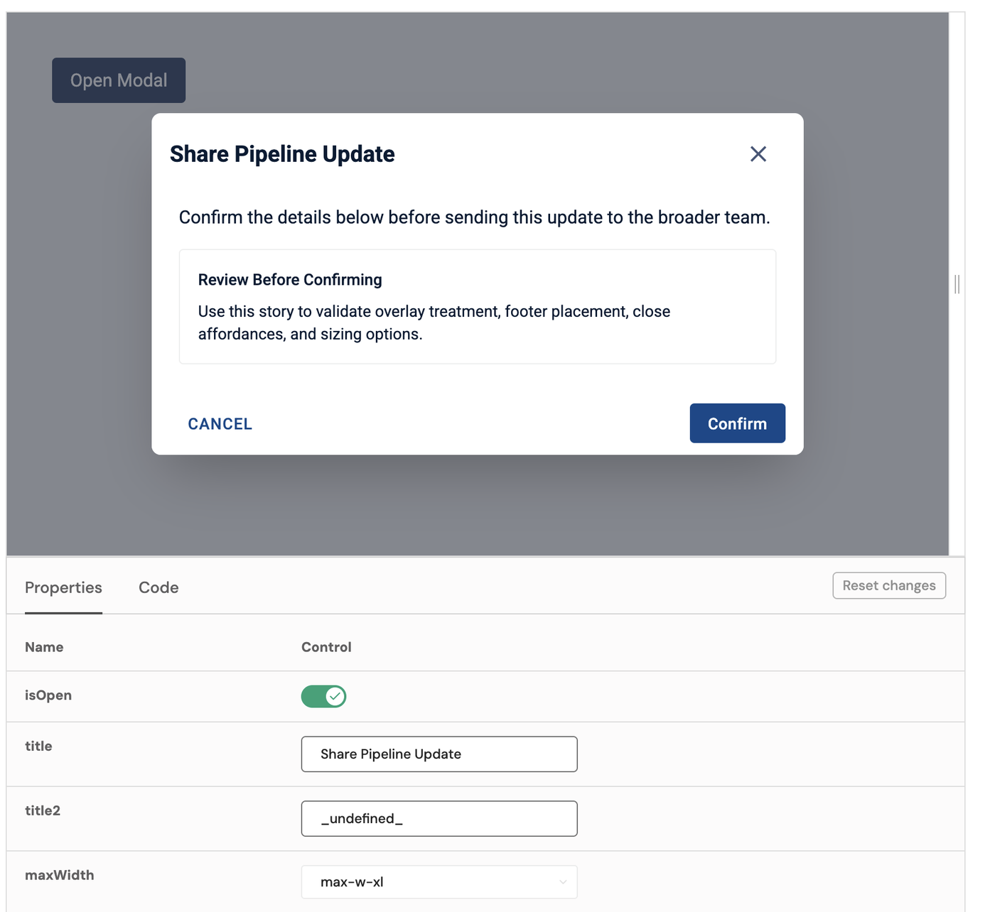
The modal dialog story in Storybook, with a live modal above a controls table for isOpen, title, and maxWidth
Try it live
Switch a prop on or off, edit the title, or pick a width, and the component updates right away. Reset changes puts it back.
Same names in both places
The modal’s props table lists isOpen, title, title2, and maxWidth, the same controls that sit beside the live story.
One source of truth
Design and engineering look at the same running component, so questions about behavior have one place to be answered.
Every component has one
All 14 components and the sidebar navigation pattern link to a Storybook preview from their Code section.