Mobile onboarding, design language, and accessibility
Result
Onboarding drop-off cut from 14% to 1%
Measured
Six months before vs. six months after launch
PetDesk helps pet owners manage their pet’s health and stay in touch with their vet. New users were leaving during onboarding, so I helped redesign it. The new flow explains what the app is for, drops a forced detour, asks for notifications with a reason and a choice, and gives every screen one accessible design language.
Before and after, at a glance
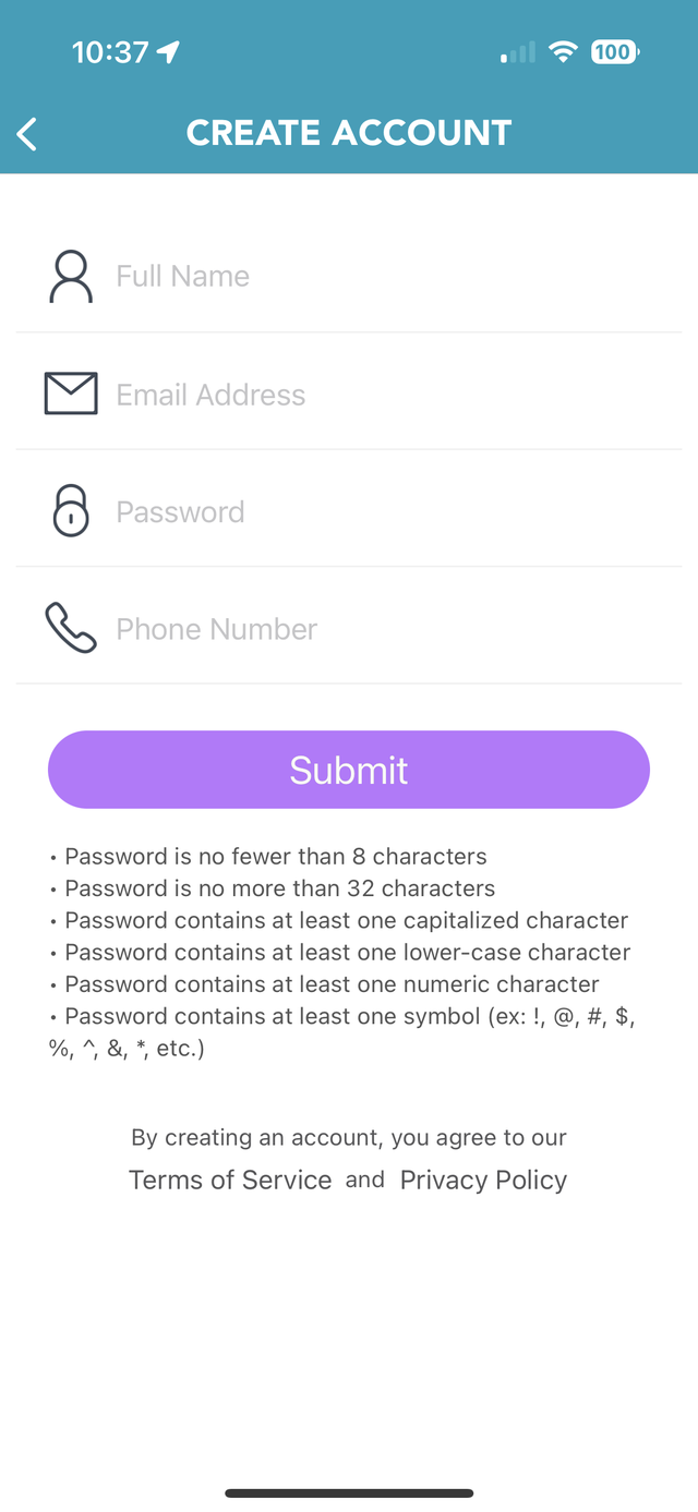
The old flow ran four screens: a splash screen, account creation, a required step to add a pet, and a notification prompt. The new flow is also four steps, but each one does a different job. The pet step is no longer a gate, notifications follow sign-up with context and a choice, and a Welcome screen sets expectations for what comes next.
Every screen was also redrawn to share one visual language. The rows below show both flows in order.
Before
Four screens, three visual styles, one forced detour
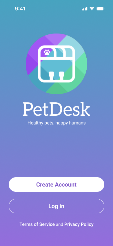
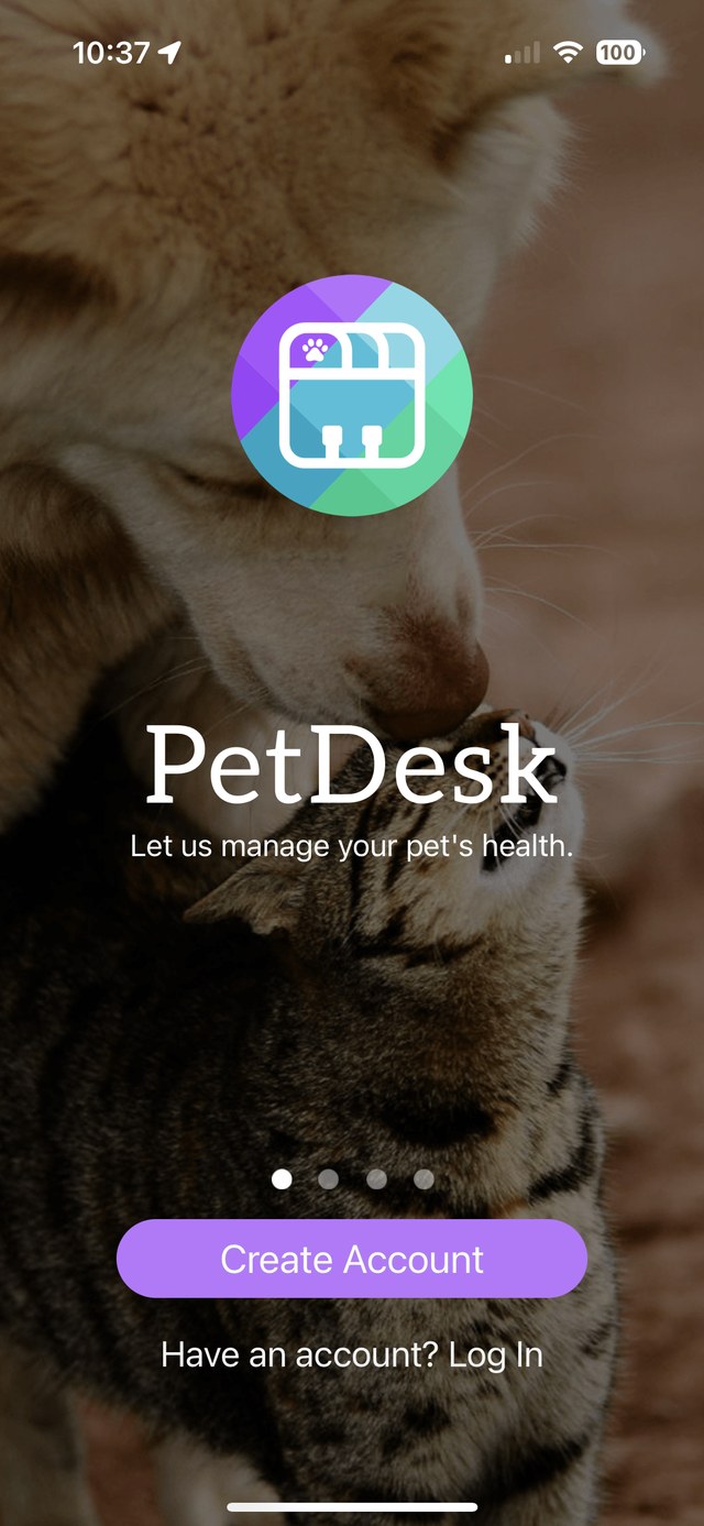
1 · SplashRestyled2 · Create accountRestyled3 · Add your petRemoved as a gate4 · NotificationsMoved and rewritten
After
Four screens, one design language, no gate
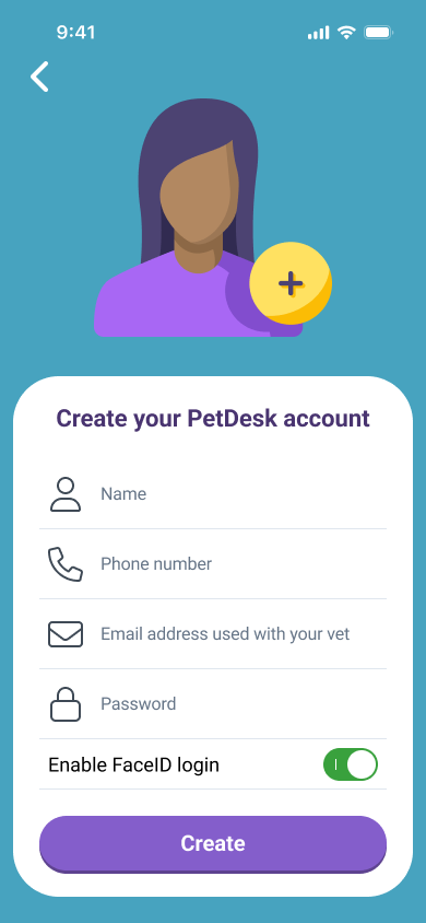
1 · SplashRestyled2 · Create accountRestyled3 · NotificationsMoved and rewritten4 · WelcomePet info is now a to-do
Why people were leaving
Onboarding had three problems that fed each other. People weren’t sure what PetDesk was for, they weren’t given a reason to turn on notifications, and they were pulled into adding a pet before they had seen anything of the app.
Underneath all three sat a design problem. The screens didn’t look like they belonged together, which made the whole experience feel less clear and less trustworthy.
14%
onboarding drop-off in the six months before the redesign
Unclear purpose
New users weren’t sure what PetDesk was for, or what they would get from finishing setup.
Notifications without context
The prompt arrived at the very end and never made its case, so it felt like an interruption instead of a benefit.
A detour before the payoff
Users had to add a pet before they had explored the app, so onboarding felt long and left them asking why.
One app, one design language
The original screens looked like they came from different products. Buttons changed shape and color from one screen to the next, the artwork mixed a photograph, a cartoon illustration, and thin line art, and the layout of each screen was different.
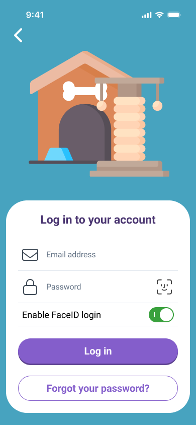
I set a single design language and applied it to every screen in the flow: one button family, one illustration style, one palette drawn from the PetDesk logo, and one layout, a white sheet on a colored field.
Buttons: four buttons, three looks, became one family
Before
Each screen had its own button.
SplashPill · light purple
Create Account
Create accountPill · light purple
Submit
PetsRectangle · dark purple
FINISH
NotificationsPill · teal
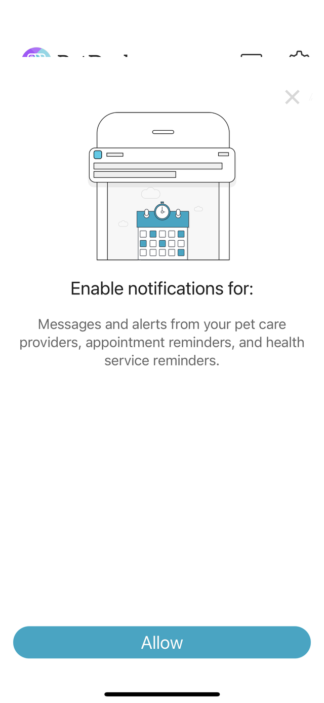
Allow
After
Create, Log in, Get started, and Continue are all the same button.
PrimaryFull-width pill · purple
Get started
SecondaryOutlined pill
Forgot your password?
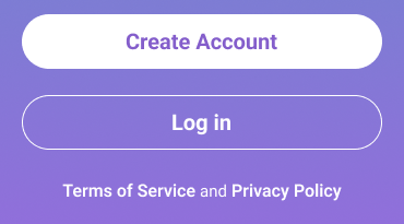
On a color fieldWhite pill and outlined pill
Create AccountLog in
Artwork: from three styles to one
Before
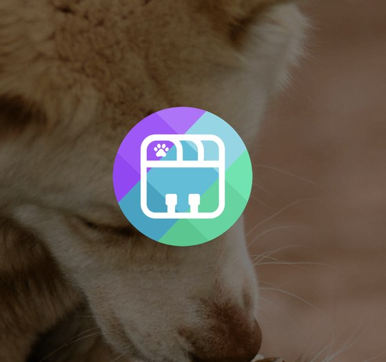
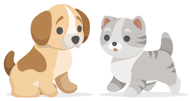
A photograph, a cartoon, and line art, across three screens
Splash · photograph
Pets · cartoon illustration
Notifications · thin line art
After
One flat style, one palette, and one colored field per step
Create account
Log in
Notifications
Welcome
Layout and color: one structure for every screen
Each step gets a color from the logo’s purple, teal, and green, and each one is built the same way: an illustration on a colored field, then a white sheet with a heading, a short block of content, and one primary action.
Illustration
Color field from the logo
Heading
White sheet for all content
Icon-led inputs
Labeled switch
Primary action
Secondary action
Accessible by default
I treated accessibility as part of the redesign from the first sketch, not as a pass at the end. The old screens leaned on light text over photography and on controls that were easy to miss. The new ones follow a few simple rules.
Here is what changed, side by side.
Before
After
Actions look like actions
On the old splash screen, Log In was a line of white text over a photograph. Now it is a bordered button on a flat color field, so it reads as something you can press whatever is behind it.
Before
After
Choices you can see and operate
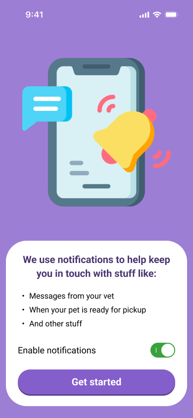
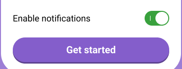
The old prompt offered a bright Allow button and little else. The new screen pairs a labeled switch with a Get started button, so turning notifications on or off is an explicit, visible choice.
Before
After
Plain, specific language
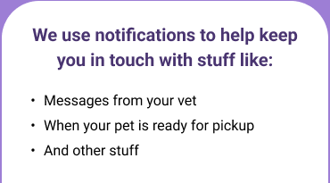
The old copy was one gray sentence of general categories. The new copy opens with a bold lead-in and three short bullets that name what people will actually get.
How it’s applied across the flow
Content sits on solid surfaces
Headings, instructions, and form fields live on white sheets with dark text, instead of over photography or artwork.
One button family, everywhere
Same shape, same color, same full-width size, and the same spot near the bottom of the screen, so people learn it once.
Face ID as another way in
The create-account and log-in screens offer Face ID, giving people who find typing passwords hard another way to get in.
Color is never the only cue
Each step has its own color, and also a clear heading, an illustration, and labeled controls, so color helps people orient without carrying the meaning alone.
Letting people see the app first
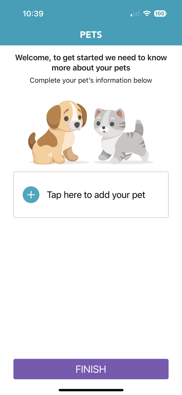
In the old flow, the Pets screen asked people to add a pet before they had seen anything of the app. Nothing explained why it was needed, and it caused a lot of drop-off. The big FINISH button also read as the end of setup, and then another screen appeared.
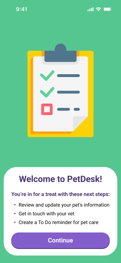
I removed the gate. Pet information is now one item on a short to-do list on the Welcome to PetDesk screen, next to getting in touch with the vet and creating a pet-care reminder. People do it when they choose, with the app in front of them.
Before · Pets, a required stepAfter · Welcome, pet info as a to-do
A gate with no explanation
The Pets screen asked for details before anyone had explored the app, with no sign of why it mattered. Many people left right there.
A false finish
The large FINISH button signaled the end of setup. Then a notification prompt appeared, so onboarding seemed to end twice.
Pet info becomes a to-do
“Review and update your pet’s information” is now the first of three next steps on the Welcome screen, alongside “Get in touch with your vet” and “Create a To Do reminder for pet care.”
A clear next step
Continue takes people into the app. They know what is waiting for them and can do it in their own time.
Asking with a reason and a choice
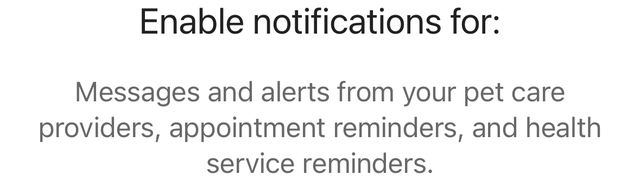
The old flow ended with a notification prompt that appeared right after FINISH. It was an unexpected extra step, it described notifications in general terms, and Allow was the only action that stood out, with no clear way to say no.
In the new flow, notifications are a deliberate step right after sign-up. The screen says what notifications are for, in plain language with concrete examples, and a switch makes turning them off a real choice. Get started then moves people on to the Welcome screen.
Before · A second ending, with one clear actionAfter · Examples, a switch, and a way forward
Out of sequence
The prompt showed up after the FINISH button, so setup felt like it ended twice.
Reasons that were too general
“Messages and alerts from your pet care providers, appointment reminders, and health service reminders” didn’t tell people what they would actually receive.
Part of one flow
Notifications now follow account creation and come before the Welcome screen, so the steps run in a logical order.
A reason and a choice
Examples like “Messages from your vet” and “When your pet is ready for pickup” explain the value, and the Enable notifications switch lets people decide.
Drop-off, nearly gone
Comparing the six months before the redesign with the six months after it, onboarding drop-off fell from 14% to 1%.
The new flow gets people into the app sooner, tells them what it’s for, and asks for things only once there’s a reason to.
BeforeSix months before the redesign
14%
0%100%
AfterSix months after the redesign
1%
0%100%
What changed
A clearer purpose
The Welcome screen lays out what comes next: review pet information, get in touch with your vet, and set up a pet-care reminder.
No forced detour
Adding a pet moved from a gate in the middle of setup to an item on a to-do list.
Notifications with a reason
The prompt now sits in the flow, explains what it is for, and lets people choose.
One accessible design language
One button family, one illustration style, one layout, and content on solid surfaces across every screen.